 So you take the photo of your artwork and then discover...it's crooked! Here are the simple steps to go from a "Do Over" to "It's Perfect." (This also works if you deliberately shoot at an angle to reduce glare off the painting surface.)
I am using Photoshop Elements, the pared down version of the big version for graphic designers. Still has everything I need. And I've given up on the fancy lighting. I just put the painting on the floor and shoot. (FYI - you can get photoshop for the MAC - I use mine all the time because it will resize when IPhoto won't.)
Open your image. Then click the View drop down menu and select "grid"
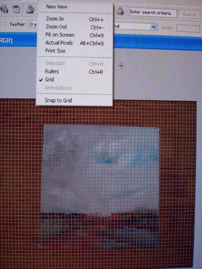
The grid is confusing to me at this point so I reduce the size of my image (roll the controller thing on the mouse) or use Ctrl - (minus sign) until only the bold lines are visible. Now you can see how far out of square your image is.
 Next open the Image drop down menu and select Transform - then skew. You will be asked "background layer" say yes, then "layer 0" say ok.
 Using your mouse, put the pointer on one of the corner circles and drag the image, using your grid lines to help you keep things square. This works in all 4 directions if you need them.
Now go back to View and uncheck the grid.
 Then select the crop tool (Rectangular Marquee tool) and crop your now square image.
 Next, you want to adjust for the lack of perfect lighting. Select Enhance, then Adjust Brightness/Contrast...then Levels.
 This is the "Bell Graph" that opens up. By moving the outside triangle sliders to the starting and ending points on the graph, you keep the light to dark ratio while adjusting the lighting/brightness/contrast stuff. The triangle slider in the middle can be adjusted either way, play with it to see what it does, but usually I just leave it alone.
 You're almost done. Now, open the Layer tab (most important) and look at the bottom. If Flatten Image is in bold (it will be if you skew), then select it.
The last step is "Save As" (found in "File" top left corner of the main menu bar). Save as a tiff. This will be the image you will use for every other copy you make. A tiff does not lose data each time you open it. Then "Save As" again as a jpeg so you now have 2 copies of your image.
If you need a smaller copy, go to your tiff, duplicate the image and resize that one, then save it as a jpeg. Or resize the original jpeg.
ALWAYS -- as the VERY LAST STEP -- go to filters, then sharpen, then to unsharp mask. Your program will probably have a default selection for amount, radius and threshold. The amount should be around 100 for digital, you can increase this for print. The radius is how many pixels in the "blob" of pixels to be sharpened, and threshold has to do with the degree of difference between one section compared to the adjoining section. It's all rather confusing, but I have mine set at 100, radius 0.9 pixels, and threshold 9 levels. Sometimes I run that up a bit. Experiment to see what happens if you want to better understand it.
Try this and see if it doesn't make life easier.


